User Interfaces in Core
Warning
Flagged for Review. Incomplete or outdated information may be present.
Overview
A core component of making quality video games is good user interface design. Health bars, time limits, and dialogue are all in the category of user interface, also abbreviated as "UI". This includes anything that you want to display in 2D to the player. Core comes with built-in progress bars, images, and buttons that can all be used to make any kind of UI.
- Creating UI in Core is mostly a drag-and-drop process.
- All UI elements can be found either under "Object" > "Create UI Object" or in the "UI Elements" section of Core Content.
- All UI elements need to be contained within a UI Container object. Drag a UI Container into the hierarchy to start working on UI.
- All UI elements do different things and be combined in many ways.
Info
Words like widget, control, and element are used interchangeably here to refer to a CoreObject that is dragged from the UI Editor.
Tutorial
Each widget works a little differently, but all are set up in the same basic way. Below is an example using the "Text Box" control:
-
UI can be found in two different locations, but both contain the same things. Use either the Object menu at the top of the screen, or the UI Elements section of Core Content. In this case, let's use Core Content.
-
Scroll to the bottom of the Core Content window, and click the UI Elements section within the "GAME OBJECTS" category.
On the right several different options will be displayed, and these are the pieces we're looking for!
-
First we need something to hold the UI. So select the UI Container object, and drag this into your project Hierarchy. This is an object that cannot have any transformations, and only exists to hold UI within it.
-
Next, from that UI Elements section of Core Content, click the UI Text Box, and drag this on top of the UI Container we just made. It should now be displaying on-screen in the viewport as well!

-
With the UI Text Box in the Hierarchy selected, look in the Properties window.
-
Move the Text Box into the desired location using either the white dotted bounding box around the element in the editor window, or by adjusting the numbers of the X / Y Offset in the Properties window.
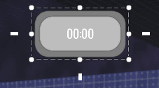
- The Text Box has several properties that can be changed via the Properties window, that all alter the display and behavior of a UI element on different screens.
UI Placement on Different Screen Resolutions
UI elements need to be anchored to a part of the screen so that the elements still snap to the correct locations on different screen resolutions. These positions can be changed in the Properties window. So if you want your UI to always stay in the very center of the screen, change the Dock property to Middle Center.
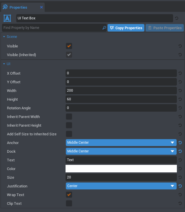
Adjustable properties of the Text Box:
X and Y Offset determine the position away from the anchor origin that the UI widget will display.
Width and Height refer to that of the widget.
Rotation Angle is as it says--based on the Transform Pivot.
Inherit Parent Width and Height will determine whether the widget stretches in size to fit the transformations of the parent.
Adjust Self Size to Inherited Size works when one of the Inherit Parent Size boxes is checked on, and will add the dimensions on this UI element to the dimensions of the parent element.
Anchor determines where children of this element will be docked.
Dock determines where this UI element is positioned relative to its parent.
Text determines what text is displayed.
Color decides the color of the font.
Size is the size of the font.
Justification is the alignment of the text within the text box.
Wrap Text determines whether the text will wrap to fix the space allowed.
Clip Text determines whether the text will cut off when going out of bounds, or continue on our of the bounds.
Different UI Elements will have slightly different settings in the properties window, and all of these can be manipulated both in-editor and in code.
For Scripting Help see Lua API for functions & properties of UI controls.
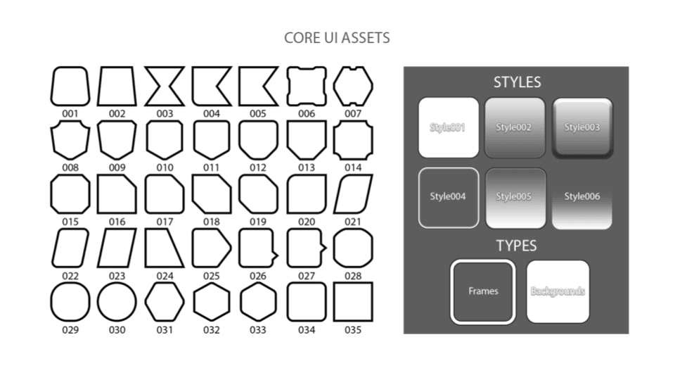
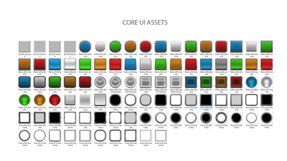
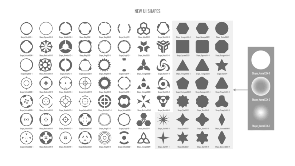
Core 2D Images
There is a large collection of different images to use in Core. These could be stretched, layered, and combined in any sort of way to create UI!
These are all the current images available to use in Core:
![]()
Examples
- Spellshock contains functioning UI, and can be found in the Community Games section of the Core Editor.
Was this page helpful? Can it be improved? Please let us know your feedback!